Mobile apps increase customer engagement and brand loyalty. However, the efficacy of an app largely depends on a positive user experience. Forty-six percent of people will stop using an app due to poor performance.
User experience, of course, hinges on mobile app design.
Design can make or break an app. Aesthetics are important, but so is a seamless experience and usability. Design can even help you guide users or customers towards the actions you want them to take.
It’s vital to get mobile app design right. In order to assist you, we put together this guide to equip you with the knowledge to do just that.
The mobile app design process

Creating an app is one of the biggest projects you’ll undertake as a business. Thus, we’d like to give you a brief overview of what the mobile app design process looks like.
It’s important for you to know the steps a good mobile app designer will take to help you achieve your goals.
Step 1: Design discovery
In this phase, you and your designer discuss what you hope to achieve with your app and what the project will entail.
The designer goes on to perform a competitive analysis. They look at your competitors’ apps and their pitfalls, and establish how to make your mobile application better than any other in your niche industry.
Furthermore, your designers establish user personas so that they can design an app with the user in mind. Through user research the designers gauges aspects such as user motivations and pain points.
Step 2: User experience design
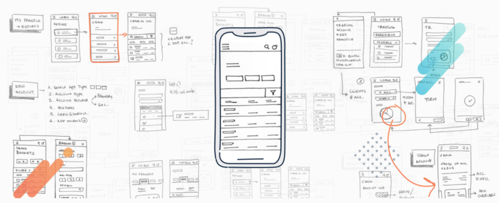
Next, the designer determines how people will interact with your app and how they can meet their needs. One of the most important goals is to make the app easy to use and navigate.
This process involves creating the following:
- A feature map. A high-level breakdown of the app’s key features.
- User flows. Charts and workflows that demonstrate the user journey.
- Wireframes. A basic layout of each screen and the overall structure of the app.
Step 3: User interface design
Using your brand guidelines, the designer generates a few style concepts for the UI design. These guidelines will give you an idea of what the final visual design will look like.
Next, your designers create a style guide for the app that contains all of the main elements such as fonts, colors, buttons, and so on.
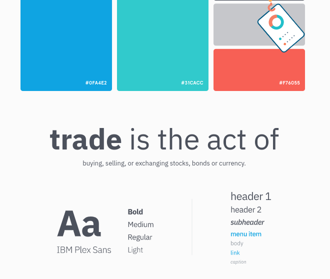
Then they combine the wireframes and style guide to create a high-fidelity mockup.
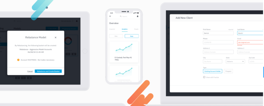
At this point in the process, you are close to the final design. It’s important to remember you can provide feedback to your design team, and adjustments will be made to suit your needs.
Step 4: Prototyping
Finally, the designer creates a high-fidelity clickable prototype. This gives you the chance to see both the visuals and UX in real time. During the prototyping phase, you also have the opportunity to test the mobile application for yourself or through further user research and testing.
Designing for mobile vs. desktop or web

There are some key differences between designing a mobile application and a desktop app or website. It is important to keep these differences in mind as they impact your application’s usability. Failing to tailor your applications to these differences may cause your users to get frustrated and abandon your app.
Here are the key differences between mobile app, desktop app, and web design:
- Screen size. Mobile has a smaller screen. Therefore, you can only include the most important text and elements.
- Screen orientation. Mobile users mostly use a vertical screen orientation, while desktop is horizontal. This affects the order in which you place elements.
- Input and navigation. Desktop users input information via a mouse or keyboard. Mobile users must tap the screen. Because of this, icons, menus, and other design elements must be an easy-to-use, tappable size.
- Usage environment. Mobile users can interact with apps anywhere, even while on-the-go. Design elements must therefore be clear and simple, so users can interact with the app efficiently.
iOS vs. Android design

Many wonder whether to build a native app for Android or Apple iOS. Android has a 71% market share — much larger than iOS (~28%). But, to ignore iOS would be to ignore a third of the market. So ultimately the best option is to create an app for both platforms. However, the code for a native app doesn’t work on both operating systems.
iOS and Android users are accustomed to different app features, visuals and user experience, based on a set of app design principles or tenets. For example, Android navigation menus tend to open on the left of the screen, while iPhone or iPad apps tend to have a navigation bar running along the bottom of the screen. Each operating system has distinctive styles that users are familiar with. Icons, typography, buttons, and the like appear differently on iOS and Android.
The examples below refer to some of the principles of Android and iOS app Design, which we’ll dive into more detail for.
Apple’s app design is based on the following three tenets:

- Minimalistic design
- A content-first approach to content prioritization with the presence of crisp elements
- A lesser use of shadows joined with the introduction of color with the aim to create a layer feeling between app elements
On the other hand, Android too has its own set of principles, known as ‘Material Design Guidelines’, which Google has been working on establishing from 2011 to 2014. The essence of the Android app design combines elements of skeuomorphism with flat design principles, which introduce certain screens and elements that contain depth and interactivity through movement into the flat environment, allowing for a realistic user experience. The following 4 are the main Android principles:
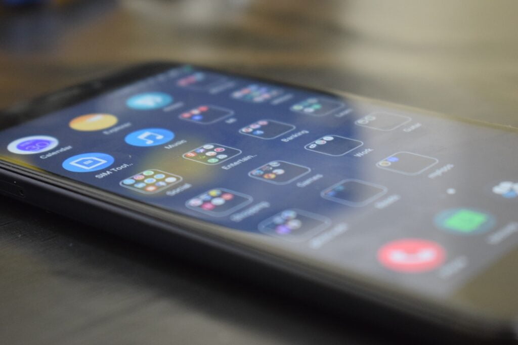
- Presence of elevation. All objects and elements are elevated at different heights, and to differentiate their place on a particular screen, they have shadows. This way, users can distinguish between the main aspects from those that sit at a second place, thus navigating the interface intuitively.
- Bold graphic design.Thanks to the implementation of elements borrowed from printed design, this principle contributes to the content hierarchy and focuses attention on the desired features.
- Meaningful animation and seamless transitions. These features create a cohesive interface and harmony between the different elements, ruling out unexpected screens and illogical features.
- An adaptive design that allows for apps to work on all the different devices that run Android OS. These devices range from computers, phones, smartwatches, tablets, etc. Android app designers should bear in mind that they are not only designing for mobile phones, but for a wide array of devices; therefore cross-platform functionality should be present.
Not only does the architectural design impact user experience, but so does the visual design of the app. Trying to carry Android styles and features across to iOS may cause users to become lost and frustrated. Be mindful of the differences in design between Android and iOS in order to create the most user-friendly app for all mobile devices.
Along with taking into account these differences when designing and developing mobile apps, there are four major development approaches that can be taken advantage of. When choosing the right one for a project, the team involved, ranging from developers to UX researchers and designers, carefully consider a wide range of variables and aspects such as the desired user experience, computing resources, requirements and native features that are required by the app, as well as other non-technical factors such as development budget, time constraints, and the destined resources for app maintenance. The following four approaches are:
- Native mobile applications
These apps are directly written in the programming language and frameworks that the app will run on. This means that they are exclusively written on operating systems such as iOS or Android. The main advantage is that native mobile applications possess the best runtime performance as well as a direct access to the devices APIs when developing the application. On the downside, these apps have higher maintenance and development costs since they need multiple code-bases for each platform.
- Cross-Platform native mobile applications
Cross-platform native mobile applications can be written in multiple programming languages and frameworks, and are usually compiled into a native application that runs directly on a devices’ operating system. The main advantage of these applications is that they provide a single code base for a variety of platforms, alongside being relatively easy to develop and maintain. This, in turn, contributes to a cost reduction in the maintenance and development costs.
- Hybrid mobile applications
Hybrid mobile applications are usually developed with what’s known as standard programming languages, such as JavasScript, HTML5 and CSS, but what makes them different is that they are bundled as app installation packages. The main advantage of hybrid applications is building them entails the same set of skills as developing web products or platforms, whilst also sharing their base code between web and mobile applications. Contrary to native applications, hybrid applications provide a better browser runtime experience, alongside serving as a link between native devices APIs via Apache Cordova. Apart from these differences, these applications have a lower performance rate in comparison to Native Apps, as well as having limited support for those features that 100% belong to native devices.
- Progressive web applications
Progressive web applications (PWAs) are an alternative to the three approaches previously described. They are essentially web applications that make use of multiple browser capabilities to provide a user experience and interface that looks and feels like an application. These capabilities include offline modes, running background processes and home-screen linking, and more. Their key advantage is this approach both works for web and mobile applications, and users don’t have to install or download any programs, since these platforms are available through a URL. All these benefits are to the detriment of offering a limited support for native device features, along with being dependent on the user’s browser. From Twitter to Starbucks, PWAs are becoming increasingly popular, with a large number of enterprises noting significant improvements in their product’s performance (increased time spent on their pages, conversions, revenue, etc.) after their implementation.
Mobile app design best practices

With a strong understanding of mobile app design practices, you can fully participate in the design of your app and the app development process. When you understand what works and what doesn’t, you’ll be able to make smart decisions and increase the likelihood that your app is a great success. Next, we’ll share some of the best practices in mobile app design that our teams use on a daily basis.
1. Keep cognitive load and data input to a minimum
Follow the good old design maxim of K.I.S.S (Keep it Simple, Stupid). In other words, don’t overwhelm users with too much information or too many functions.
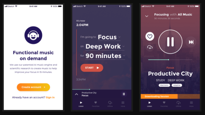
Keep interactions quick and simple. For example, reduce the number of fields in forms, help users out with autocorrect or dropdown menus, and only ask for one or two interactions per screen. Build focusing on user goals and design for interruption, but don’t interrupt their natural flows. Allow your users to save their progress and re-engage later on with your content in the same point of their journey from where they stopped.
2. Let the user have control
Users should fully understand what will happen when they tap on an icon or button. For this reason, you should use visual elements that clearly represent the function they’re connected to. Alongside visual elements, breathing rooms and blank spaces also speak volumes when implementing a clean UX/UI design. This also helps users realize which content prevails and what elements are more relevant. Reducing clutter not only improves user experience, but enhances comprehension and increases the way users interact with your product.
Furthermore, it is also important to make error messages as informative as possible. This means that users know what to do to resolve an issue or what steps to take next if something goes awry.
3. Make navigation clear
Create a logical information structure so that users can get around your app easily. By making a strategic use of different visual elements, you can guide users through your menu options, making it clear to the user where they are and how to return to previous screens, with useful headers and highly visible back buttons, for example. Providing an orderly navigation increases the users’ exploration, and avoids confusion and a reduction of engagement.
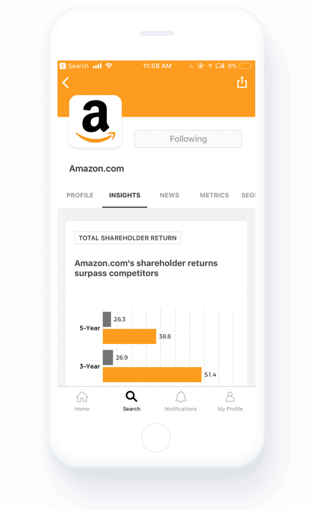
As time passes, you may wish to employ user testing and monitoring to adjust app navigation. Make it so that the most frequented destinations and paths require the fewest taps. A coherent navigation structure also inspires users to engage and interact with your product, by accommodating to your user bases’ needs and desires. Getting to know the way users will use your application allows you to create a UI structure that minimizes the user’s memory load by simplifying actions and making the different path options visible.
4. Onboard users
Retaining app users is tough. The average retention rate on day one is 24.1%, by day seven this drops to 8.1%, and the numbers only decrease from there. Because of this, it’s vital you make a positive first impression. Throughout the design process, keep an eye out for any points of friction that may cause users to drop off.
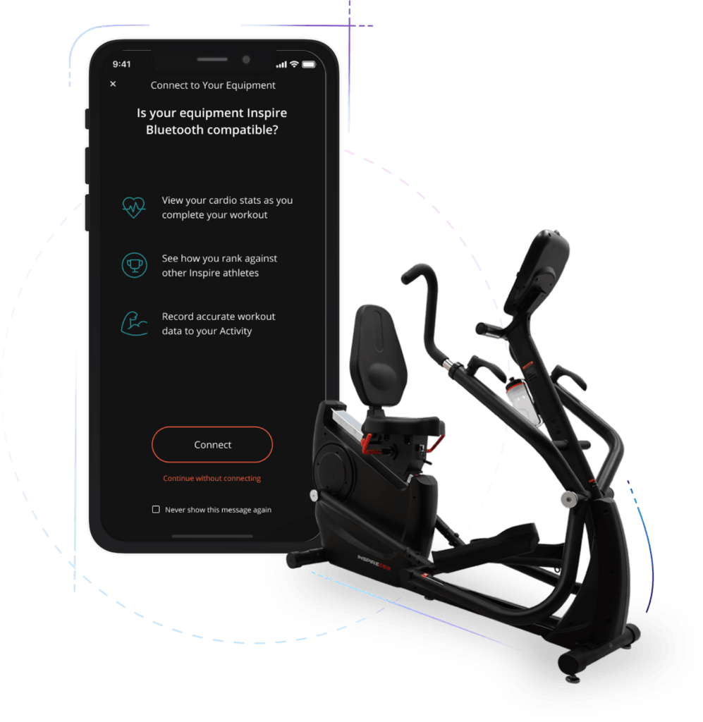
As part of the onboarding process, give new users a demo or tour of the app when they install it or sign up. Point out the key functionalities and navigation. Helping them get started is the first obstacle. Providing a great onboarding experience from beginning to end is a great tool to push your product and avoid falling into high abandonment rates, as well as turning it into a long term strategy that can help generate strong metrics such as user retention and lifetime value, if well taken advantage of.
5. Remember the bigger picture
Naturally, you need to ensure app visuals align with your branding. Imagine if Coca-Cola strayed away from red one day. It would leave a lot of people confused. But, you also need to consider the fact that there are many touch points between you and a customer or audience member these days.
You should make sure the design and content of your app mirror other channels, ex., your website or social media accounts. Remember that at the end of the day despite working with digital deliverables, both you and your team are creating a product that is composed of different expressions that should be coherent and aligned with each other, all while living under the same brand identity world.
6. Optimize images, video, and text for mobile
Today’s mobile devices require high-quality images. It is important to make sure you use high-res images that don’t appear pixelated in HD. You also need to get the aspect ratio right so that images don’t appear stretched out on mobile.
Because of the way people play videos on their phones, all video content must be optimized for portrait mode. In the case of Android, this operating system has a special navigation bar for internal interactions, called built-in back navigation, that iOS does not. This built-in back navigation provides users with the opportunity to move one step back or undo their previous action. This feature is available on several apps, and it can also serve as a type of upward navigation.

When it comes to text, readability is key. Choose an easy-to-read font that stands out against the screen’s background. For example, when it comes to differentiating between iOS and Android, developers and designers will have to bear in mind the typography. For iOS, they use San Francisco in 17pt for the base font, meanwhile the Android operating system characterizes itself for using Roboto in 16sp for the base font.
7. Design for touch
Taking into account that touch screens aren’t going anywhere and trends point to their sizes to keep expanding, another best practice your team should bear in mind when creating is designing for touch screen devices. It is important to make the application easy for users to navigate your app and perform actions by easily tapping elements. A good rule of thumb is to make buttons approximately 10mm, given the average size of a person’s fingertips. Another key rule is to make sure there’s enough space between buttons to avoid mistaken taps.
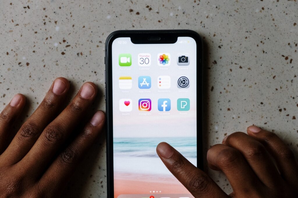
A key factor to weigh in is the fact that 49% of users hold their phone with just one hand, while just 15% do it with both hands. Since screen sizes are more than likely to continue expanding in size, involving these user behaviors in the mobile design process should be another practice to implement for your product.
For example, a common practice is to place ‘destructive’ or dangerous actions in hard-to-reach zones so that users don’t accidentally tap or access them when holding their devices. On the contrary, it’s a good idea to place elements that users interact with frequently in easy-to-reach areas. By thinking, analyzing, and studying the way users hold their phones your team will gain informative insights for your mobile app design.
7 mobile app design trends

We want to share with you what has been hot in the world of mobile app design in the past few years. Let these trends serve as inspiration for your own mobile app design.
- Swipe animations: Swiping became much more interesting and engaging through the addition of animations.
- Dark themes: UX designers helped protect the eyes of users that are usually glued to their phones with low-light themes.
- Soothing visuals:Tranquil colors and images eased eye strain.
- Custom illustrations: Forget stock images, and enhance your applications experience with custom graphic design to fit your branding.
- Rounded shapes:Professional designers took away sharp angles to create more fluid, borderless designs.
- Unique data visualizations: The graphs and charts that are a huge part of so many apps got way more creative.
- AR and VR: Immersive experiences within apps continued to grow.
Final words
If you’re running a startup, a mobile app might be at the center of your business. Or perhaps an app will be another critical channel for your e-commerce store. Either way, creating an app could be enormously beneficial. But, this is only the case if the app is well-designed. The biggest takeaway here is that the user should always be at the front of your mind when designing a mobile app. If you are looking for a team with an expertise in mobile app design, check out the work from our App Solutions Studio.

