


CSS has evolved into a powerful language. This article provides a nutshell of some of its transformative features, including concepts like :has(), :is(), :where(), CSS Nesting, and Container Queries, showcasing how they are reshaping modern web development.
What’s covered in this article
Reliable References for Feature Use
Initiatives and tools that clarify feature readiness, browser compatibility, and modern best practices.
CSS Nesting
Native support for writing nested selectors for cleaner, scoped styles.
:has()
A powerful selector that styles elements based on their children or siblings.
:is() & :where()
Tools to simplify complex selectors and manage specificity.
Container Queries
Style components based on their parent’s size, not just the viewport.
Before exploring specific CSS features, it’s useful to highlight a few key resources that support modern web development. Platforms like web.dev, the Baseline initiative, and Can I Use provide essential guidance on feature readiness, browser support, and best practices. They serve as reliable reference points for evaluating which features are safe to adopt in real-world projects.
Reliable References for Feature Use
Web.dev
web.dev is a site created by Google to help developers build high-quality web experiences. It offers articles, tutorials, and tools written by members of the Chrome team and other experts in web development. The goal is to improve the overall quality and user experience of the web by providing developers with the knowledge and resources they need.
Baseline
Baseline provides a clear reference point for determining whether web platform features are ready to be safely adopted. The initiative aims to standardize the adoption of web features, ensuring developers can safely integrate new technologies. By relying on Baseline, teams can more easily decide when it makes sense to use a feature, helping speed up decisions and reduce uncertainty in the development process.
Features become part of Baseline once they are supported across a defined set of core browsers. The initiative recognizes two stages of adoption: Newly available, for features that work in the latest versions, and Widely available, for those with long-term, broad support. Before reaching either stage, a feature is considered to have Limited availability.
Baseline statuses are visible directly on resources like MDN and Can I Use, making it easy to check whether a feature is ready to use. Full criteria and the core browser set can be explored in the official Baseline documentation.
Can I Use
Can I Use is a widely used resource that provides up-to-date browser support tables for HTML, CSS, JavaScript, and other front-end web technologies. It allows developers to quickly check if a specific feature is supported in various browser versions, helping prevent compatibility issues before they arise.
By searching for a property or API, you get a clear, color-coded overview of its support status, along with usage data, notes, and known issues. It’s a fast way to understand whether a feature is safe to use.Can I Use is community-driven and open source, with contributions from developers around the world.
Now let’s dive into the CSS features this article set out to highlight.
CSS Nesting – Making Stylesheets Structured, Scalable, and Maintainable
Write nested selectors in a native way, similar to Sass, without relying on preprocessors—improving structure and maintainability.
This feature allows related styles to be aggregated into a single structure within the CSS document, improving readability and maintainability.
/* Before*/
.card { outline: solid 2px #292929; }
.card .subtitle { color: gray; }

/* After */
.card {
  outline: solid 2px #292929;
  .subtitle { color: gray; }
}
Before: Every selector needed to be explicitly declared, separately from one another. This led to repetition, stylesheet bulk, and a fragmented or hard-to-follow structure.
After: Related selectors can now be grouped together using nesting, resulting in more concise and structured stylesheets.
/* Before */
.nesting { color: pink;}
.nesting > .is { color: red;}
.nesting > .is > .awesome { color: grey; }

/* After */
.nesting {
  color: pink;
  > .is {
    color: red;
    > .awesome {
      color: grey;
    }
  }
}
If the .nesting component were removed from the project, the nested approach would allow you to delete the entire block at once, instead of searching through multiple scattered selectors across the stylesheet.
Nesting can help with: Organization | Reducing file size | Refactoring
Nesting Selector
The nesting selector (&) explicitly states the relationship between parent and child rules when using CSS nesting. It makes the nested child rule selectors relative to the parent element. Without the & nesting selector, the child rule selector selects child elements.
.button {
  color: white;
  background-color: blue;

  /* Targets the same element if it also has a .rimary class */
  &.primary {
    background-color: royalblue;
  }

  /* Targets the same element if it is hovered */
  &:hover {
    background-color: navy;
  }
}
The & nesting selector makes the nested rule relative to the parent selector (.button in this case):
- &.primary targets .button.primary — the same element with an additional class
- &:hover target .button:hover — the hover state of the same element
Without the &, the nested rules would target child elements, like .button .primary or .button :hover, which is not the intended behavior in this case.
Mixing nesting and declarations
Consider the following nesting CSS block:
.card {
  color:green;
  & { color: blue }
  color: red;
}

/* Resulting CSS */

.card {
  color: green; /* hoisted */
  color: red; /* hoisted */
}

.card {
  color: blue; /* nested block */
}
The color of .card elements will be blue.
When you write CSS with both regular declarations and nested selectors in the same block, the browser hoists regular declarations to the top of the rule.
This means that any nested selectors are treated as separate blocks, and the cascade order (the order in which styles are applied) may not follow the written sequence.
The key advice
To avoid unexpected order or conflicts:
- Put direct declarations (not inside a nested block) at the top of your rule
- Once you start nesting, use & for any following declarations, even if you’re still targeting the same element — this keeps things predictable and grouped
:has() – The Parent Selector We’ve Been Waiting For
A game-changing relational pseudo-class that allows you to select an element if it contains or is related to specific child, descendant, or sibling elements. This was previously not possible with pure CSS and required JavaScript.
selector:has(selector)
The selector before :has() defines the element to style.
The selector inside :has() defines the related element(s) the rule depends on.
Usage Examples
Descendant combinator
div:has(.child)
Matches a div with any descendant having the class .child
Child combinator
div:has(> .child)
Matches a div with a direct child having the class .child
Adjacent combinator
p:has(+ img)
Matches a p immediately followed by an <img>
General Sibling
div:has(~ .sibling)
Matches a div with any following sibling having the class .sibling
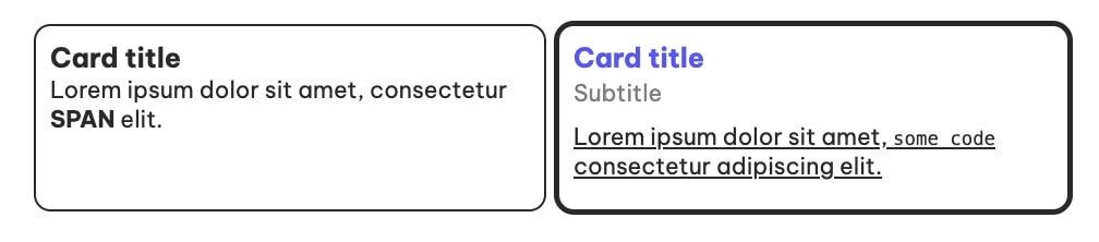
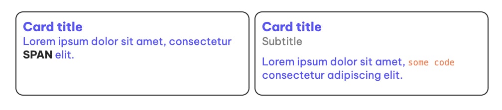
.cards-wrapper {
  display: flex;
  gap: 10px;

  .card {
    width: 350px;
    border-radius: 10px;
    outline: solid 2px #292929;
    padding: 10px;

    /*
    Example: General sibling
    */
    h3:has(~ .subtitle) {
      margin-bottom: 2px;
    }

    /*
    Example: Child combinator
    */
    &:has(> span) {
      outline-width: 4px;
    }

    /*
    Example: Adjacent combinator
    */
    h3:has(+ span) {
      color: #5955FA;
    }

    .subtitle {
      color: gray;
      display: block;
      margin-bottom: 10px;
    }

    /*
    Example: Descendant combinator
    */
    p:has(code) {
      text-decoration: underline;
    }
  }
}
Logical Operations
The :has() relational selector can be used to check if one of the multiple features is true or if all the features are true.
By using comma-separated values inside the :has() relational selector, you are checking to see if any of the parameters exist. x:has(a, b) will style x if descendant a OR b exists.
By chaining together multiple :has() relational selectors together, you are checking to see if all of the parameters exist. x:has(a):has(b) will style x if descendant a AND b exist.
.cards-wrapper {
  display: flex;
  gap: 10px;
  .card {
    width: 350px;
    border-radius: 10px;
    outline: solid 2px #292929;
    padding: 10px;
    .subtitle {
      color: gray;
      display: block;
      margin-bottom: 10px;
    }
    /*
    Example comma-separated - OR
    */
    p:has(span, code) {
      text-decoration: underline;
    }
    /*
    Example chaining - AND
    */
    p:has(span):has(code) {
      color: red;
    }
  }
}
:not() combination
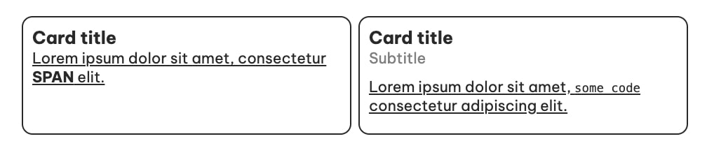
Combining :has() with :not() allows for powerful conditional styling based on what an element doesn’t contain.
p:has(:not(span))
Select every <p> element that contains at least one child that is not a <span>
p:not(:has(span))
Select every <p> that does not contain a <span> at all.
.cards-wrapper {
display: flex;
gap: 10px;
.card {
width: 350px;
border-radius: 10px;
outline: solid 2px #292929;
padding: 10px;
/*
Example: :not() combinator
*/
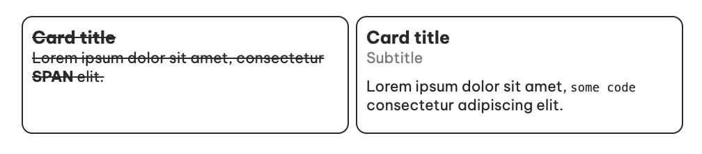
&:not(:has(.subtitle)) {
text-decoration: line-through;
}
/*
Example: :not() combinator
The following would select every <h3> element that contains at least one child that is not a .subtitle.
*/
/*
&:has(:not(.subtitle)) {
text-decoration: line-through;
}
*/
.subtitle {
color: gray;
display: block;
margin-bottom: 10px;
}
}
}Potential Pitfall
- Styling Unwanted Components: If .specific-element exists in unrelated parts, the rule may incorrectly apply styles to the parent container.
- Dynamic Content: In applications with dynamically added elements, unintended styles can easily occur if :has() isn’t scoped to specific structures.
- Performance Impact: Broad selectors like :has(.specific-element) force the browser to check all descendants, increasing the cost in deeply nested or dynamic DOMs.
Solution: Add Specificity
Approach: Combine :has() with scoped and direct child selectors.
Benefit: Prevents styles from leaking into irrelevant components and improves rendering efficiency.
Key Takeaways
Be specific when using :has() to balance performance and styling precision. Avoid unintended effects by scoping the target structure, especially in dynamic and nested environments.
:is() & :where() – Writing Smarter Selectors
They simplify and optimize complex selectors by allowing you to group multiple conditions.
Key differences
:is() Contributes specificity from its contents
:where() Always has zero specificity, no matter what’s inside
Key Use Cases
:is() Use when you need to match multiple selectors and maintain specificity
:where() Use for utility styles where you don’t want to impact specificity (e.g., consistent margins, resets)
How each works
:is() Evaluates a group of selectors and applies styles if any of the selectors inside matches. It is subject to specificity. The specificity of the most specific selector inside :is() applies to the rule.
:where() Works similarly to :is(), but with zero specificity. It never contributes specificity, making it ideal for applying styles without affecting existing rules.
Example 1
.cards-wrapper {
display: flex;
gap: 10px;
.card {
width: 350px;
border-radius: 10px;
outline: solid 2px #292929;
padding: 10px;
.subtitle {
color: gray;
display: block;
margin-bottom: 10px;
}
}
/*
Fails: invalid selector
.1a - breaks the entire rule
*/
.card h3,
.card p,
.card .1a {
color: red;
}
/*
Works: :is() ignores invalid selector
*/
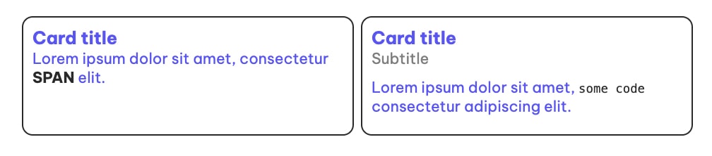
.card :is(h3, p, .1a) {
color: #5955FA;
}
}Example 2
.cards-wrapper {
display: flex;
gap: 10px;
.card {
width: 350px;
border-radius: 10px;
outline: solid 2px #292929;
padding: 10px;
.subtitle {
color: gray;
display: block;
margin-bottom: 10px;
}
}
/*
Examples: :is() overrides :where() due to higher specificity,
even when declared later in the stylesheet.
The :where() pseudo-class has zero specificity.
*/
.card :is(h3, p) {
color: #5955FA;
}
.card :where(h3, p, code) {
color: coral;
}
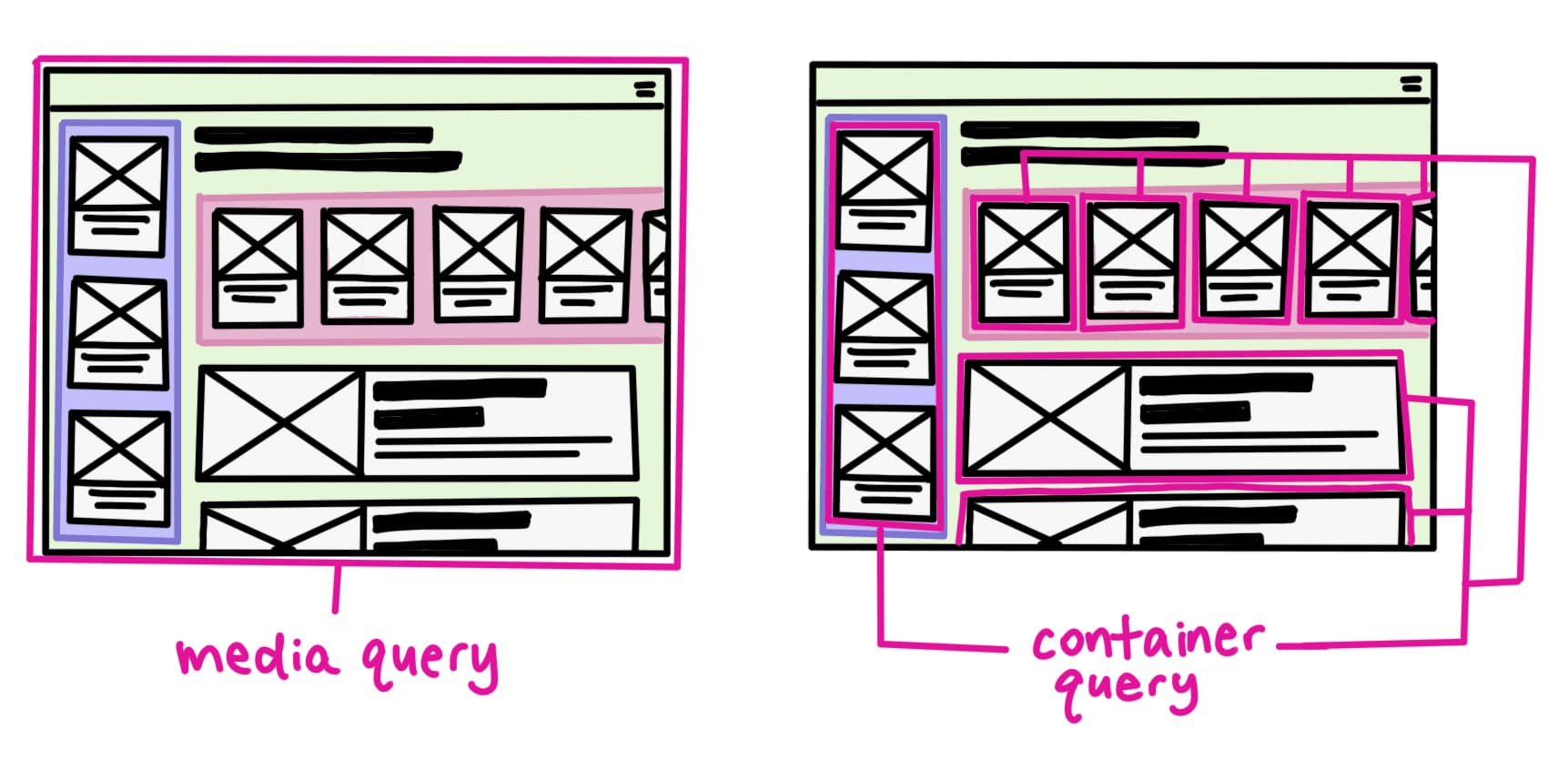
}Container Queries – Responsive Design Beyond Viewport
Style elements based on the size of their parent container, not just the viewport—unlocking true component-based responsiveness.
Container queries and media queries are both useful tools for creating responsive designs.
The main difference between the two is that media queries apply styles based on the viewport size or other device characteristics, while container queries apply styles based on the size of an element’s container.
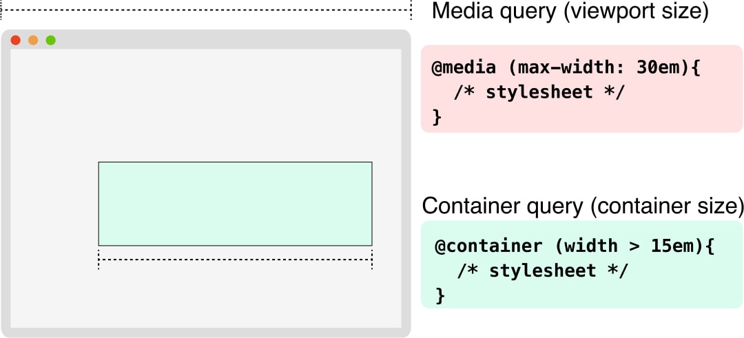
Traditionally, we’ve used media queries that look at the viewport size to make layout decisions. But often we want components to adapt based on their container’s size, not the whole viewport.
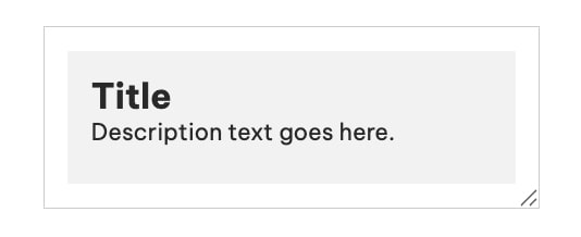
Think of a card component that needs to display differently when it’s in a narrow sidebar versus a wide main content area.
A simple example
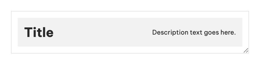
- Below 500px, the .card content is stacked vertically
- At 500px and above, it switches to a horizontal layout, making it more adaptable to its container’s size—not the viewport
/* Define the container as a queryable container */
.card-container {
  /* Enables container queries based on width (not height) */
  container-type: inline-size;
  /* Give this container a name so we can reference it in @container rules */
  container-name: card;

  border: 1px solid #ccc;
  padding: 1rem;
  max-width: 600px;
  /* Allows user to manually resize for demo purposes */
  resize: horizontal;
  overflow: auto;
}

/* Default layout for the card (when container is narrow) */
.card {
  background: #f2f2f2;
  padding: 1rem;
  display: flex;
  /* Stack content vertically by default */
  flex-direction: column;
}

/* Container Query: Apply styles when container is at least 500px wide */
@container card (min-width: 500px) {
  .card {
    /* Change layout to horizontal */
    flex-direction: row;
    /* Space out the children */
    justify-content: space-between;
    /* Align items vertically */
    align-items: center;
  }

  .card h2 {
    /* Make the title bigger on wider containers */
    font-size: 2rem;
  }

  .card p {
    /* Add space between title and description */
    margin-left: 1rem;
    margin-bottom: 0;
  }
}
Benefits
The benefits of container queries include:
- True component independence – components can adapt to their immediate context
- More reusable components that work in different layout contexts
- Better encapsulation of responsive behavior
- Reduced need for media query breakpoint coordination across components
This feature fundamentally changes how we can approach responsive design, moving from a global viewport-based approach to a more modular, component-based one.
It’s particularly valuable for design systems and reusable component libraries.
Do we still need Media Queries?
Container queries are a great way to design more flexible and responsive layouts without having to use fixed breakpoints, having said that, combination of container queries and media queries technique will be one of the best way forward to achieve a great responsive web design.
@media can handle the big picture stuff, user preferences and global styles
@container will take care of all the micro-adjustments inside the components
Wrapping Up
Modern CSS is about empowering components to be smarter, more adaptable, and better scoped. Features like :has(), :is(), :where(), CSS Nesting, and Container Queries mark a significant shift toward modular, maintainable, and context-aware design systems.
By combining these tools with reliable references like web.dev, Baseline, and Can I Use, developers can confidently adopt modern CSS features backed by real-world support and best practices.
Whether you’re building reusable components, improving responsiveness, or simplifying selector logic, these modern capabilities allow CSS to scale with your application’s needs. As the language continues to evolve, embracing these tools will lead to cleaner code, smarter styling decisions, and better user experiences.

